Friday, April 7, 2017

Almost at the End!

The deadline of the project is approaching, which means stress!!! But also excitement!!!! My group members and I made a few changes, such as, the background of our cover page is no longer black, we decided on a gray color because it looks less photoshopped and goes better with our color scheme. We did encounter a slight dilemma over the cover image. I think the image looks better in black and white, since most aesthetically pleasing fitness magazines follow this convention and it makes the color scheme pop out more. Another group member insisted that we should put the cover image in color with the gray background. We asked our classmates and the black and white photo won because it looked more clean and more attractive to the eye. The colored image tended to distract from the hot pink masthead and yellow accents on our cover lines, and didn't pair well with the gray background. We also found an easy website to make our magazine flip like a tangible one in order to give the final product a more realistic look (website: flipsnack). We added page numbers (small detail, but highly important!) Our process is closely coming to an end! I have also been writing the script for my CCR.  
"Progress is impossible without change." -George Bernard Shaw

Wednesday, April 5, 2017

Double Page Spread!!

I finally decided on my double page spread layout!! Most fitness magazines have simple, clean layouts with two/three columns and not a lot of writing. The font is usually strict letters incorporated with bold font. My layout also includes a quote from the spinning instructor I interviewed that is inspirational and motivational to the target audience, since that's want they want to gain from this magazine. I have compiled all the information from the interview with Penelope (the indoor cycling instructor). I have almost all the images I'm going to use for the double page spread, but Saturday morning I'm going to her spinning class at the gym to take a photo of Penelope. Now, I just have to type up the story and add the images onto the layout I have created. My last visit to the gym I took so many photos of bikes and feet pedaling from all different angles. Some of them were posted on a previous blog post. My double page spread layout consists of three pictures:
1) Photo of Penelope (main focus)
2) Long shot of the indoor bikes (some angles of this shot are seen below)
3) Close up of feet pedaling


I'm so happy and proud to see how long I have come since the beginning of this process and can't wait to see the final product (soon)! Stay tuned!

Citations:

  • Laurengibney Follow. "Codes and Conventions of a Double Page Spread." LinkedIn SlideShare. N.p., 30 Oct. 2011. Web. 05 Apr. 2017.
  • "Double Page Spread Analysis." Regional Fitness Magazine -A2 Media Portfolio. N.p., 10 Mar. 2016. Web. 05 Apr. 2017. 


Tuesday, April 4, 2017

Table of Contents!!

Today I went to the gym and took SO MANY pictures for my table of contents. I had an idea of what pictures I wanted to take since I first started brainstorming for this magazine, so it was just a matter of capturing my vision. I had to test out different angles and lighting. Lighting was a bit of a problem because not all areas of the gym had high key lighting and I wanted to capture a bright image. The worst thing was trying to capture an image and the shadows of people walking by or working out would cast onto it. Fun fact: I took over 100 pictures just of the mat with gym equipment to get the perfect one! At first, my group and I had one contents page and then we realized that in order for the magazine to flow properly, we would need a double page table of contents. Our layout consists of one main image and then the stories listed with a description and page number. Since we needed to add a second page, we flipped the layout to make it look more dynamic and added a sell line to draw more attention. Here is my draft for my two page table of contents (the pictures aren't final, but they're the ones I like most):


Sunday, April 2, 2017

Vision Come True!

I started to play around with the pictures by editing them and I finished the front cover. Kind of. My vision was to have a solid black background and have my main subject as the cover image. At first, I didn't know how to remove the background from a picture, so it was quite challenging. I tested out several websites but none of them gave me the results I wanted. Then, I realized that Microsoft Word has this tool and I spent hours trying to crop it perfectly and let me tell you, it's a hard thing to do. Not to mention, Canva wasn't cooperating either. I have yet to get it down exactly right but here is my draft:
I'm super proud of how it came out because it's exactly what I envisioned. At first, I thought I wouldn't be able to put a solid black background, but I set myself to accomplish it. Like I said before, it's not the final product as you can still see some flaws due to the background removing. I also made progress on my table of contents, but I'll be going back to the gym to get another picture for the contents page. Lastly, I have gathered all the information to start writing my double page spread along with the pictures. I'm still deciding on the layout for my double page spread. Can't wait to put it all together!!

Saturday, April 1, 2017

Pictures!

So today I went to LA Fitness to take pictures for my cover image as well as double page spread. Wait, let me rewind. The woman I was meaning to interview and use as my front cover is out of town (sigh), but I got a new idea! When I went to the gym today, I interviewed a spinning instructor to get insight on her experiences with this group exercise class. I'm using her as my cover image and will make my double page spread based on spinning and her personal experiences and advice as an instructor. Some of the questions I asked her were:
-What was your motivation to become a spinning instructor?
-What is the average of calories burned per class?
-What do you eat before and after the workout?
-Which muscles are mainly used while doing spinning?
-Do you recommend spinning to lose weight?
-Personal experiences with the exercise (weight loss)
I still have to edit the pictures and choose the perfect ones (I took A LOT). Here are a few:


 (This photo of her is the cover image in black and white)


Thursday, March 30, 2017

Changes on Changes

Today my group and I decided on some changes as well as new aspects for our magazine!! Yay!! After having group meetings to get feedback from my peers, they suggested that the red masthead with yellow accents in the cover lines, paired with the black and white cover image, gave off a slightly masculine look. I did research to see what colors can portray a more feminine look in order to attract the target audience. Pink! The color pink represents health, beauty, and femininity, which are all factors that contribute to fitness and appeal to women. Yellow and pink are also complimetary colors and give the magazine a vibrant, energetic feel. We also made font changes since I got feedback that our original font also contributed to a more male audience with the use of bulky letters. We decided on the table of contents layout and I finished it (mostly) by adding all my stories with the page numbers, and a short description for each because it's a widely used genre convention for these magazines. I also moved the cover lines around to make it seem more evenly dispersed and have the cover story at the top of the page to draw in more attention to the content. I'm missing my cover image and the table of contents image, which I will be getting soon! All these changes were inspired by research (of course), feedback from my peers, and this issue of Strong Magazine:

Citations: 
  • "Meaning of Colors in Color Psychology." Empowered By Color. N.p., n.d. Web. 30 Mar. 2017.
  • "Color Harmonies." Color Harmonies: Complementary, Analogous, Triadic Color Schemes. N.p., n.d. Web. 30 Mar. 2017.

Thursday, March 23, 2017

One Step Closer!

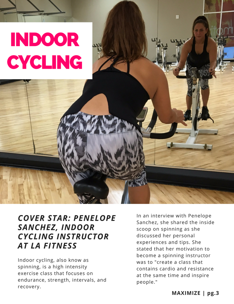
Today my group and I decided we will be using the software Canva to create our magazine! The cover page is one step closer from transferring my vision onto a digital platform. While using Canva, we encountered several layouts that would fit our genre, but not quite the perfect one. So we had to play with it and modify colors, fonts, and sizes. Of course this isn't my cover image, since my cover story is still undecided (fitness woman hasn't given me a response yet, ugh). Within my group, we decided that our cover image will be in black and white because it makes the colors pop out and gives our magazine a trademark that is easily recognizable across various issues. It's also important to establish the masthead clearly, so the black and white background allows the title to be the main focus. When we were trying out different designs, our original font seemed too masculine and we want to keep the magazine geared towards our specific target audience, females. Therefore, we changed the font to a less boxy and more straight letters font. Utilizing a black and white cover image makes the context stand out and gives the cover a more serious, dominant look, which conveys strength. The cover page will be clean without an overwhelming sensation of words, which makes it easier to the eyes and looks better visually.

Citations:

  • "Canva." Amazingly Simple Graphic Design Software – Canva. N.p., n.d. Web. 24 Mar. 2017.
  • Rai, Rajbol. "Analysis of Codes and Convention of 3 Magazine Front Cover." Prezi.com. N.p., 19 Nov. 2015. Web. 24 Mar. 2017.
  • "The Best and Worst Fitness Magazines of 2015." THE RUSSELLS. N.p., 28 Jan. 2015. Web. 24 Mar. 2017.


Wednesday, March 22, 2017

Table of Contents!

Now your'e probably thinking "Table of contents??? What about the cover page??" I haven't finalized the cover page since I'm still testing out various designing softwares to get the perfect layout. I have decided to do some research on the T.O.C (table of contents) and get a better idea of what layout would be clean and aesthetically pleasing. Research shows that most fitness magazines have a two page T.O.C and include pictures of main articles. The typical layout is strict letters and aligned photos as well as the same color scheme as cover page. This gives the table of contents a very rigid feel and boxed-in look. They also include page numbers and a short description of articles. I believe that a more creative and unique T.O.C has a more feminine vibe to it and is easy to follow through. The layout shown to the right is what I would like to accomplish for my magazine. I love the stylistic elements in this T.O.C because it's easy to follow, easy to the eyes, and challenges the normal genre conventions of fitness magazines. Stay tuned!!!!


Citations:


  • Liam-lim-horgan Follow. "Codes and Conventions of a magazine contents page." LinkedIn SlideShare. N.p., 22 Jan. 2012. Web. 22 Mar. 2017.
  • "Content Page." Pinterest. N.p., n.d. Web. 22 Mar. 2017.
  • Figueroa, Claudia. "Editorial." Pinterest. N.p., 17 Feb. 2013. Web. 22 Mar. 2017.

Tuesday, March 21, 2017

YAY for Group Meetings!

Today my class did group meetings where you discuss the progress of your project
and share your ideas in order to get honest feedback from your peers. My classmates liked the title of our fitness magazine as well as my idea for the cover story (interview the woman who does all her workouts outdoors). They thought it was a unique idea and would make a good two page spread. On the other hand, they gave me advice on the color scheme for my cover page and layout. Since my masthead is a bold red color, the cover lines will include a contrasting color (thinking of yellow) in order to add color but not distract from the vividness of the masthead. Yellow represents energy and optimism, which conveys a positive and confident message towards the target audience. Research shows that yellow and red are compatible colors and are visually engaging to look at. Not to mention, this color scheme also follows the genre conventions of fitness magazines. Here are some examples:


Citations:

  • "Designworkplan." Designworkplan Wayfinding Design Signage and Color Contrast Comments. N.p., n.d. Web. 21 Mar. 2017.
  • "Media - Print." Pinterest. N.p., n.d. Web. 21 Mar. 2017.
  • Sprezzatura. "The Art of Color - What Colors Go Well Together." The Art of Color - What Colors Go Well Together. N.p., 01 Jan. 1970. Web. 21 Mar. 2017. 


Saturday, March 18, 2017

Cover Page

Today I decided to make a cover page layout for my magazine. I'm still deciding on what software to use to create the best magazine possible, therefore I drew out my cover page layout (as seen to the left).
As discussed in a previous post, the masthead is displayed at the top, bold red, and victory comics font. The date line is located right below the title (April issue). I've decided to keep my cover visually appealing with few cover lines (3) to not give it an overwhelming look. The reason I chose 21 days in one of my cover lines is because research shows that 21 is how many days it takes for a habit to form. For example, after exercising abs consistently for 21 days, it becomes a routine. As seen in another cover line, the number 17 means strength, self-discipline, and responsibility. These three factors contribute to what the target audience wants in regard to fitness. My cover story is still pending along with the cover image. Red is the color that will stand out because it's energizing, passionate, powerful, assertive, and motivating. Clean, simple magazine cover pages have the tendency to draw in the consumer more and catch the eye.


Citations:

  • Selk, Jason. "Habit Formation: The 21-Day Myth." Forbes. Forbes Magazine, 16 Apr. 2013. Web. 18 Mar. 2017.
  • Scribes, Joanne Sacred. "NUMBER 17." NUMBER 17. N.p., 01 Jan. 1970. Web. 18 Mar. 2017.\
  • "FITNESS Covers." Pinterest. N.p., n.d. Web. 18 Mar. 2017.
  • "Magazine Covers." Pinterest. N.p., n.d. Web. 18 Mar. 2017.


Friday, March 17, 2017

Cover Lines Madness

I am now brainstorming cover lines for the cover page of MAXIMIZE!!! Women's fitness magazines have the tendency to be over packed and include many cover lines in order to advertise the most articles possible. Since these magazines are usually displayed in places where women spend most of their time, such as a grocery store, these fitness magazines take advantage of trying to attract their target audience (women) with the highest degree of content. Through my research, I also learned that fitness magazines usually have 7 sell lines and rarely include secondary images from in-featuring articles. The use of banners around cover lines isn't common either, but there is a greater presence of boxed text on the cover page. I want to challenge these genre conventions by steering away from this tightly crammed cover page and create a more visually appealing piece with less cover lines. Here is what I'm trying to avoid:


Both of these cover pages are packed with content and aren't aesthetically pleasing in any way. Genre conventions in regard to cover lines that I will follow when creating my magazine is writing tips and advice on how to stay fit because that's what the target audience wants to gain upon buying these magazines. 

Citations:

  • Truji Follow, Alberto. "Codes and Conventions - Fitness & Lifestyle." LinkedIn SlideShare. N.p., 04 Mar. 2015. Web. 17 Mar. 2017.
  • "Writing Cover Lines for Magazines." Pigfender. N.p., 06 Mar. 2014. Web. 17 Mar. 2017.
  • Adams, Erika. "Why Can't Fitness Magazines Cash In on the Wellness Craze?" Racked. Racked, 25 Jan. 2016. Web. 17 Mar. 2017.
  • "FITNESS Turns 20! Editors' Top 20 Favorite FITNESS Covers." Fitness Magazine. N.p., 10 Apr. 2012. Web. 17 Mar. 2017.

Tuesday, March 14, 2017

Progress!

The font for our masthead (MAXIMIZE) has been decided! Based on genre conventions of fitness magazines, titles are usually bold, straight, and large letters. It's displayed at the top of the cover page and in upper case font. This masthead immediately draws the consumer's attention as well as portray a dominant look. As stated in a previous post, our title will be a vivid red color. After scrolling through countless fonts, we found the perfect one. I present to you…..
maximize 
(Name of font: Victory comics)

On another note, I have been brainstorming ideas for my cover story. My aunt's good friend is a fitness freak who does all her workouts outdoors, this is called bodyweight training. I'm going to contact her and ask for an interview since her way of fitness is unique and a creative way of getting toned. I researched types of outdoor exercises to get a better idea of what this "no gym workout" entails of. Stay tuned to see if she agrees to the interview!

Citations:
  • "Victory - Search." DaFont. N.p., n.d. Web. 14 Mar. 2017.
  • Follow. "Front Cover Analysis - Fitness." LinkedIn SlideShare. N.p., 04 Mar. 2015. Web. 14 Mar. 2017.
  • "No Gym? No Weights? No Problem." Muscle & Fitness. N.p., n.d. Web. 14 Mar. 2017.
 "N

Sunday, March 12, 2017

Target? Audience?

What's a magazine without a target audience? Nothing. The target audience is an essential aspect of creating any form of media. Clearly understanding your target audience allows for better marketing strategies and more profit. With that being said, let me share the target audience for MAXIMIZE. Women. Middle Class. 20-38 years old. Now that's just the very basics of it all. While doing my research, I found specific characteristics and statistics on my target audience:

- 76% exercise three or more times a week
- 71% are members of a gym
- 89% exercise outdoors
Readers have an average of 3 different fitness activities they regularly pursue
- Spend an average of $430 a year on vitamins and supplements
- 18% work in the health & fitness industry
- 89% would like to learn more about the health & fitness courses that are available
- 85% intend to go to a spa based holiday within the next 12 months
- 91% holiday abroad each year
- 34% consume 3 or more sports drinks in a week
- 64% stated ‘running’ as their most regularly pursued fitness activity
- 96% of readers incorporate some form of running within their fitness regime
- 54% are single women and 46% are married women 

Citations:
  • Heal, Women’S. Media Kit 2016Women’s Health Media Kit 2015 INTEGRATED Mission Statement(n.d.): n. pag. Women's Health Magazine. Web. 12 Mar. 2017.
  • Knight, Joanna. "Women's Fitness." Dennis Publishing. N.p., n.d. Web. 12 Mar. 2017.
  • "4 Steps for Defining a Target Audience." PRINT. N.p., n.d. Web. 12 Mar. 2017.

Masthead Dilemma

It's hard coming up with a title for your magazine, especially when ALL YOUR IDEAS ARE ALREADY TAKEN!!!! That was an exaggeration, we did come up with titles that are unique and new. Here are some titles that we brainstormed:

  • Alive 
  • Endurance 
  • Energy 
  • Tolerance 
  • Strength 
  • Maximize 
  • Stamina 
  • Strategy 
  • Well-Being 

We all really liked the sound of Endurance, but sadly it's already a magazine. It seemed nearly impossible to decide on a title, until we finally agreed on MAXIMIZE!! After doing research about genre conventions, we came to the conclusion that our masthead will be a bold red color since red conveys passion, strength, power, and sensuality. These connotations go hand-in-hand with the genre and portray the target audience's wants.
Fun fact: The color red is most highly associated with people making quick decisions (like buying a magazine!!)

Inspiration of a red masthead:


Citations:
  • Albertotruji Follow. "Codes and Conventions - Fitness & Lifestyle." LinkedIn SlideShare. N.p., 04 Mar. 2015. Web. 12 Mar. 2017. 


Fitness or Fashion??

Welcome to my blog! Embarking on this journey, I was torn between doing a fitness magazine or a fashion magazine. I am deeply passionate about both topics and have ideas constantly popping up in my head, which doesn't make this process any easier. Of course, the first step in making this decision is research, research, and you guessed it, research! Here is the overall information I have compiled in regards to both genres: 

Fitness                                                        vs.                          Fashion 
- Cover image of fitness model                                                  - Cover image of celebrity 
- Use of numbers in cover lines                                                 - Large cover lines 
- Bright colors                                                                          - One color stands out 
- One word masthead                                                               - Large masthead 
- Includes tips and recipes                                                        - Use of numbers in cover lines
- Motivates women                                                                   - Empowers women  


After doing research for both genres, my group and I decided that a fitness magazine was the way to go!! One of my favorite quotes of all time reads:

"If you're not passionate, then you're wasting your time."

This quote is the foundation of completing an amazing project, since passion is what drives motivation. I couldn't be more excited to be working on a project that truly sparks my interest and makes me motivated to complete the best looking fitness magazine out there!